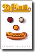
 It’s probably the hot dog that makes me hungry when I see the cover of BIG MOUTH. Then again, maybe it’s the tomatoes, or the bowl of mustard, or the onions, or the long squishy line of mustard, all items that turn a plain old frank into a full-fledged meal. Or maybe, quite simply, it’s the red and yellow title. Looks like a fast food joint logo, doesn’t it?
During my interview with the North County Times this summer, the reporter asked me if I’d used the colors red and yellow in BIG MOUTH strategically. “Absolutely,” I replied. “Sort of….” The reporter was referring to the fact that fast food companies use red and yellow in their logos because color psychologists have determined that red and yellow make people hungry, and Big Mouth is all about food. The truth is, I didn’t have that in mind when I chose to feature red and yellow my story. I was strictly focused on the ketchup/mustard relationship. When I decided to have a ketchup company sponsor the school in Big Mouth, I was doing it because ketchup is associated with hot dogs and because there was a controversy a few years back that had government agencies declaring ketchup a “vegetable” so that they could say their school lunches offered that extra serving of veggies. Since I like to take things to the extreme in my books, I had the ketchup company, Del Heiny Ketchup Company, demand that the whole school be painted red, that every food in the cafeteria be ketchup-dunkable (Del Heiny cares about students’ health, after all), and that every school’s mascot be changed to a tomato. Good-bye, Fighting Tigers; hello, Proud Plum Tomatoes. I knew that in a school like this, rebellion was guaranteed. And what’s the opposite of ketchup? Mustard, of course. Hence, the Mustard Rebellion in Big Mouth, which has yellow pitted against red in a color war of epic proportions.
So while I used red and yellow strategically, I actually put them in opposition to each other. McDonald’s and other fast food joints combine them to make millions. Who’s the smart one?
Here’s the psychology of it: Red is the color that makes people hungry. Red instantly attracts attention and it also makes people excited, energetic, and increases the heart rate. Fast food companies have a large amount of red in their branding, which subconsciously lets customers know that the chain is high-energy, bustling, and, most importantly, fast. Yellow is an attention getter. It is the most difficult color for the eye to take in, so it can be overpowering if overused. Yellow enhances concentration, which is why it’s used for legal pads. It also speeds metabolism. So red and yellow, when combined, will get your attention and stimulate your appetite.
But was McDonald’s being any more strategic than I was when they chose red and yellow as their colors in the early 1950’s? This is from an article for the AIGA, a professional association for designers:
Red and Yellow Kills a Fellow
by David Barringer, August 28, 2006“Before McDonald’s, red and yellow had a cautionary history in America. Standardizing traffic signs in 1924, highway departments required stop signs to have white letters on red while caution signs had black letters on yellow. The first lone McDonald’s opened in 1940 in San Bernadino, California, and catered to drive-up customers. In 1948, it ditched the carhops and delivered the world’s first fast-food burgers…. Four years later, the first pair of golden arches reflected the rays of the Arizona sun. The golden arches were added as an architectural flourish in 1953, a year before Roy Kroc showed up (Kroc launched the franchise in 1955; other 1954 visitors included the founders of Burger King and Taco Bell). In the 1960s, the arches were removed from the brick and mortar and installed in the logo.
McDonald’s grew into a global behemoth, begetting its thousands of red-and-yellow fast-food children all over the world, to the extent that it’s possible most people today, when confronted with blank blobs of red and yellow, might think, “Big Mac,” before they think “traffic warning” or “radiation” or “fire hazard.”
With McDonald’s having done the work of spreading the red-and-yellow gospel, maybe fast-food joints decided to ride the golden coattails.
“For those companies that don’t have strong brand recognition, the me-too approach is hard to go against,” acknowledges Leslie Harrington, principal of LH Color, a consulting and research firm that helps companies better use color in their products and brands. “It would be very hard for the smaller restaurants on Main Street, USA, to challenge the paradigm. It’s also difficult for McDonald’s to ever change because they created the monster. They’re in the same boat as UPS, which owns brown whether they like it or not.”
The uniformity of the global McDonald’s brand has likely colored the brand of global fast-food.”
So maybe it’s not the hardwiring of our brain but the incidental color choice of McDonald’s that is responsible for us feeling hungry when we see red and yellow. We’ve learned to associate those colors with fast food, so that is instantly what we think of when we see them. Just ask any kid, they’ll tell you: Red & Yellow = McDonald’s.
One study asked kids this very question. The study had youngsters sample identical McDonald’s foods in name-brand and unmarked wrappers. The unmarked foods always lost the taste test. Even carrots, milk and apple juice tasted better to the kids when they were wrapped in the familiar packaging of the Golden Arches. Interestingly, just two of the 63 children studied said they’d never eaten at McDonald’s, and about one-third ate there at least weekly. I wonder what my triplet three-year-olds would say if they’d taken part in this taste test, as they’ve never eaten at McDonald’s and have never seen a McDonald’s commercial because they don’t watch TV? They have, I will admit, played at a McDonald’s Playland. They ate home-cooked food during that playdate, but was the visit itself enough to expose them to the McD marketing machine?
I’ve always found marketing things like this fascinating. In fact, I considered going into advertising as a career at one time. I love the psychology behind manipulating people, convincing them to do or believe A when they really should do or believe B. It seems so deliciously diabolical. To open your eyes to how your eyes are being manipulated, why don’t I sign off today with a snapshot of color psychology:
Red
The most emotionally intense color, red stimulates a faster heartbeat and breathing. It is also the color of love. Red clothing gets noticed and makes the wearer appear heavier. Since it is an extreme color, red clothing might not help people in negotiations or confrontations. Red cars are popular targets for thieves. In decorating, red is usually used as an accent. Decorators say that red furniture should be perfect since it will attract attention.
Yellow
While it is considered an optimistic color, people lose their tempers more often in yellow rooms, and babies will cry more.
Black
Black is the color of authority and power. It is popular in fashion because it makes people appear thinner. It is also stylish and timeless. Black also implies submission. Priests wear black to signify submission to God. Some fashion experts say a woman wearing black implies submission to men. Black outfits can also be overpowering, or make the wearer seem aloof or evil. Villains, such as Dracula, often wear black.
White
Brides wear white to symbolize innocence and purity. White reflects light and is considered a summer color. White is popular in decorating and in fashion because it is light, neutral, and goes with everything. However, white shows dirt and is therefore more difficult to keep clean than other colors. Doctors and nurses wear white to imply sterility.
Pink
The most romantic color, pink, is more tranquilizing. Sports teams sometimes paint the locker rooms used by opposing teams bright pink so their opponents will lose energy.
Blue
The color of the sky and the ocean, blue is one of the most popular colors. It causes the opposite reaction as red. Peaceful, tranquil blue causes the body to produce calming chemicals, so it is often used in bedrooms. Blue can also be cold and depressing. Fashion consultants recommend wearing blue to job interviews because it symbolizes loyalty. People are more productive in blue rooms. Studies show weightlifters are able to handle heavier weights in blue gyms.
Green
Currently the most popular decorating color, green symbolizes nature. It is the easiest color on the eye and can improve vision. It is a calming, refreshing color. People waiting to appear on TV sit in “green rooms” to relax. Hospitals often use green because it relaxes patients. Brides in the Middle Ages wore green to symbolize fertility. Dark green is masculine, conservative, and implies wealth. However, seamstresses often refuse to use green thread on the eve of a fashion show for fear it will bring bad luck.
Purple
The color of royalty, purple connotes luxury, wealth, and sophistication. It is also feminine and romantic. However, because it is rare in nature, purple can appear artificial.
Brown
Solid, reliable brown is the color of earth and is abundant in nature. Light brown implies genuineness while dark brown is similar to wood or leather. Brown can also be sad and wistful. Men are more apt to say brown is one of their favorite colors.
 *“Me and My Big Mouth…” is an occasional series about inspirations, backstories, and random stuff tucked into my teen novel BIG MOUTH. For more about BIG MOUTH, check out www.BigMouthTheBook.com or www.DeborahHalverson.com.
